Source: blog.lab42.com
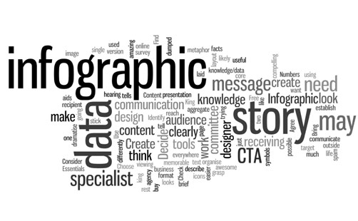
Infographics are the go-to tool for the digital age.
Combining facts, figures and visuals, they enliven any piece of online or offline content.
Once you’ve decided to spice things up and create an infographic for your next board meeting – or a presentation, blog post, report, or anything else for that matter – approach it with a solitary aim of making it completely exquisite.
Notice I didn’t say beautiful. I have nothing against beauty. I do think that beauty is always in the eye of the beholder.
However, beauty alone has no place in an infographic. Often, designers spend way too much time making their graphics pretty at the expense of everything else.
The Power of Infographics
Exquisite infographics are attractive, factual, informative, thought-provoking, concise, and bold. They help to present dry information in a meaningful and digestible way.
Take your quarterly business report. I’ve only ever seen accountants and account managers get excited about going through a stack of papers full of boring statistical data.
That data might be the most important in the world, but if it’s presented in a boring manner no one will care or give it a second glance.
This is where infographics step in. Consider the following:
- 65% of people are visual learners. This means that dry writing goes straight over their head and they are not able to comprehend data unless it has a visual component to it.
- People remember 80% of what they see and only 20% of what they read. Think about that next time you give someone a report to read. Most likely, the only thing they’ll retain from it is the headline. On the other hand, if you went to the extra trouble of creating an infographic, it may show the data that they might actually remember until your next meeting.
- Infographics are 3X more likely to get shared compared to plain text content. Do you want people to help you spread the word? Infographics have the third best share-rate and are surpassed only by images and videos.
Once you’ve labored for hours over a report or an analysis, take some extra time to create a visual representation of your work.
It will ensure that the effort you put into creating something doesn’t go unnoticed and will reach a lot more people.
5 Tips for Creating Great Infographic
1. Choose layout and colours wisely
The first thing you will want to consider when creating an infographic is the type of information you need to convey. This will dictate the layout you are going to use. You will use a different approach to layouts depending on whether you are creating flowcharts, timelines, roadmaps, or visual articles.
Your goal should always be to create a layout that has 3 elements:
- Order and hierarchy
- Balance
- White space
Mess with any of these and your infographic will be jumbled up, difficult to follow, and be unable to produce a desired effect on the audience.
When it comes to colours, stick to a neutral palette. These are much easier on the eyes than bright, vibrant colors and not as distracting.
Whenever possible, try to use your company colours when creating an infographic. Putting a personal touch on everything – including infographics – goes a long way when creating or nurturing a brand.
2. Doodle yourself
There are times when it’s absolutely acceptable to use stock images for your infographic. This is when you are working on something internal or need to watch your overall production budget.
If you’re planning on having this infographic distributed, however, consider taking the time to create images, graphics, and doodles yourself. This is a great opportunity to put an extra magic touch on something that a lot of people will see.
Making it different and unique will also allow you to differentiate yourself from the clutter of graphics that are populating the internet.
![]()
Original icons will go a long way in differentiating your infographic and adding an air of originality to it.
Source: cursorch.deviantart.com
If you can’t do it yourself, consider hiring a professional.
Make sure that they understand your company and can appreciate your company’s brand voice. Give them a detailed brief on what you want accomplished with the infographic. Most professionals take the time to do it right and will work with you closely to produce a stunning, tailor-made end product.
Remember. It’s all about originality and making an impression.
If the audience gets a déjà vu feeling when they look at your infographic, it will make it less sticky and not as memorable as you’d like it to be.
3. Use the inverted pyramid approach
Pick up a newspaper or a magazine. Take a look at how the information is structured.
Note how the headline creates urgency and grabs your attention, almost compelling you to read ahead. Take a hint from pros. Create a catchy headline that will make people want to know more.
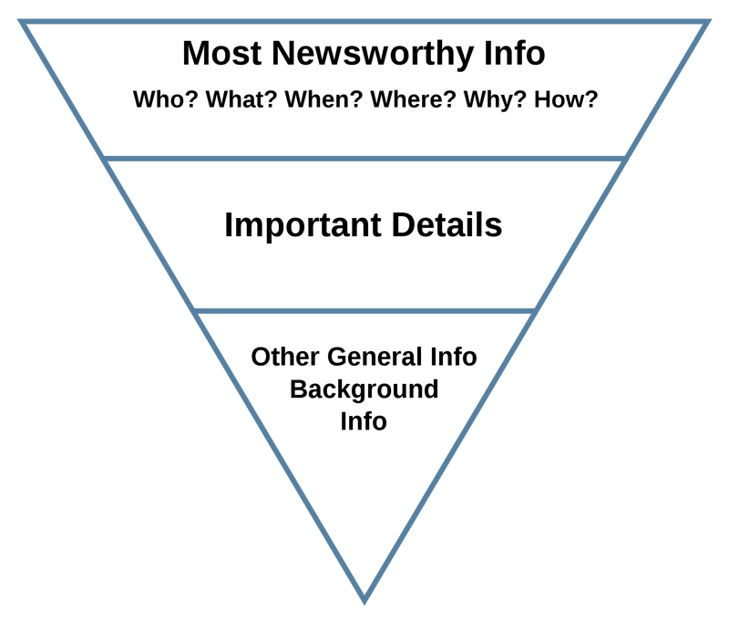
Use the inverted pyramid approach to highlight the most important stuff you want people to take away from your infographic.
Source: commons.wikimedia.org
After that, it’s just a matter of filling in the blanks. Populate the body of your infographic with interesting facts and supporting evidence for whatever it is you stated at the beginning.
Additional information should go at the bottom. This spot is usually reserved for your pitch – if it’s that kind of infographic – and include your company logo as well as the list of your sources.
4. It’s about numbers, but not boring numbers
Present your information in the most memorable way possible.
In order to do this effectively, you’re going to have to know your audience and know what they care about.
Remember to press those trigger buttons that evoke an emotional response from people. Learn what they are interested in and find ways to make your data tell a story that they will care about.

Numbers - Avoid piling up numbers and present them in an interesting and easily understandable manner.
Source: pixabay.com
Whenever possible, try to structure your data using charts and graphs and don’t be afraid to experiment.
Comparing the incomparable often results in thought-provoking graphics that your audience will appreciate. Give their brains a welcomed jolt and spur them to move in unorthodox directions.
5. Deal with facts, not fancy
As tempting as it might sound, do not tamper with the data just so the end result makes more sense. The whole point of making an infographic is to present your actual, factual data in the most appealing way possible.
Stick to the old adage; garbage in – garbage out.
If you fill your infographic with garbage, the end product is going to be just that, garbage. No one will care that it’s pretty and appealing if it is not useful.
Also, make sure to carefully select your sources.
Always try to find the most recent data so you don’t clutter it with obsolete facts – you don’t want to end up looking stupid, right?
All your sources have to be credible and you need to cite them at the end to give people an opportunity to read up on everything you touch on in the infographic.
Common mistakes to avoid
Now that we’ve covered the dos, it is time to take a quick glance at the don’ts.
There are a lot of these and each one is an instant infographic killer so make sure to err on the side of caution so you don’t end up flushing all your efforts down the drain.
- Making your infographic too long – Keep it short and sweet. People have an attention span of gnats these days. Have all the relevant and important information at the top and don’t make readers scroll down for 20 minutes in order to come to the end. Trust me, they won’t.
- Choosing small pixelated images – Use large, quality images. Regardless of how relevant to your graphic, grainy images are unprofessional and ugly. You are better off substituting them with something less pertinent that looks nice when zoomed-in.
- Forgetting about white space – Trim down the information you want to present and boil it down to essentials. Cluttering the infographic will make it unreadable. White space is supposed to be there for a reason. Do what every other designer would do – when in doubt, leave it white.
- Going for the ‘child-played-with-crayons’ effect – Great infographics are sometimes ruined by the use of too many contrasting colours. Pick three colours and stick with them, unless you want your work to resemble a Pride flag. If that is the look you’re going for, more power to you but it’s generally better to keep it simple for the sake of clarity and readability.
Too much colours - This would be a great infographic - if it wasn't for the fact that all the colours of rainbow are used on it.
Source: en.wikipedia.org
- Getting playful with fonts – Cursive and other types of fancy fonts decrease the overall readability of your infographic. Choose two fonts at most – one for the body of the text and the other one for emphasis. Try to stick to the similar font sizes throughout the infographic.
Follow the advice I have laid out here so that you can present even the most complicated information in a clean and visually appealing way.
You will be able to reach more people with your infographic. More importantly, your audiences will retain your information for a longer period of time.