Golden arches. “The happiest place on earth”. An apple with a piece bitten off.
What do these well-known icons have in common?
Well, these visual symbols are part of the brand identities of McDonald’s, Disneyland, and Apple.
One of the most valuable assets in a company, a brand is defined by the name, term, sign, symbol, design or a combination of these which identifies and differentiates a product, service, or company from its competitors.
A brand possesses both tangible and intangible value to its beholders. Called its brand equity, it would cover dimensions like brand association and personality, awareness, loyalty, and quality.
Defining Brand Identity
The external manifestation of a brand is what we call its brand identity. These are the elements which consumers would consider to help them select one brand over another.
Brand identity is the visual, auditory, olfactory (scent), gustatory (taste) articulation of a brand. Normally, this includes all design applications of the brand, such as its logo, typography, colour, images, corporate stationery, websites, physical environment and so on.
As you can see from the examples above, world class brands have very distinct visual brand identities. They are easily differentiated and distinguished from their competitors, and are clearly identifiable in an ocean of “me-too” shops, advertisements and signboards.
So what makes a brand’s visual identity stand out from the others? Let us go through each point in turn.
Logos
The most prominent element of a brand is its logo. Beyond physical applications in stores, advertisements and corporate uniforms, logos are increasingly important for your company’s online identity. They are often found on one’s website, social media profile images, and favicon icons (that small little image next to your website’s URL in browsers).
In designing logos for your company, do consider the following points:
- Suitability of images or symbols for you industry. These need to be appropriate for your business.
- The personality of your brand. Does your logo need to convey a sense of “adventure” or be “classically stylish”?
- Applications in different environments. Will the logo stand out against a sea of other logos in an advertisement?
- White space around the logos
Colours
Beyond a brand’s logo, you also need to consider the range of colours used.
Thanks to the great work of the folks from the Logo Company, we have this wonderful infographic outlining the different colour schemes used for logos and the emotions which they depict.
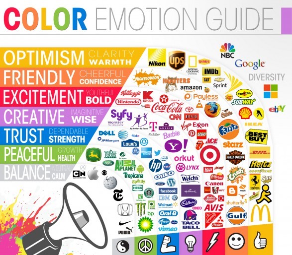
Depending on the nature of your business and your brand personality, you could choose different colour palettes and shades.
Generally speaking, a colour like grey (or silver) is a neutral shade which can be used to denote class, style and slickness. Green, on the other hand, is associated with the environment and planet Earth.
Blue is often closely linked to corporate organisations like IBM, and is well liked by technology companies like Facebook, Dell, IBM, and Twitter. Sitting at the threshold of cool and warm colours, purple is linked to imagination and creativity. It is also favoured in certain South East Asian cultures.
Red is a popular colour for logos and corporate identity elements, as you can see from the examples above. It denotes excitement and boldness, and is often associated with food.
Orange and yellow are bright and cheerful colours that are normally associated with vibrancy, warmth and youth. Brands like McDonalds, Fanta, Subway, and Ferrari sit here.
Fonts and Typography
The next thing you need to consider in your brand identity are the use of typography as well as fonts.
Quoting from Wikipedia:
Typography (from the Greek words τύπος typos "form" and γράφειν graphein "to write") is the art and technique of arranging type in order to make the language it forms most appealing to transparent learning and recognition.
Because of their visibility in your logos, mastheads and other visual identity elements, it is important to consider the role which typography and fonts play.
There are two different ways to classify fonts:
- A set of typefaces (eg Arial, or Times Roman) is what we call a font family.
- On the other hand, a general classification of fonts (like serif and sans serif) would be considered a font category.
Here are some examples of the most common font categories and how their styles translate in a logo design (adapted from turnarounddesign):
- Traditional and professional in look, serif fonts have a line at the end of each stroke.
- Sans serif fonts are those which are more modern and contemporary looking. They do not have that tiny line at the end of each stroke.
- Italics and script fonts resemble calligraphy and usually more decorative and classical in nature.
- Fonts which resemble handwriting – like comic sans – are perceived to be more fun, personal, and friendly.
- Finally, you have display like fonts that are widely varied in design and style like Wing Dings. These are usually only used for logos and not in writing.
If you are looking for something distinct and unique, you may want to pick a lesser known font or even create your own font to stand out from the competition.
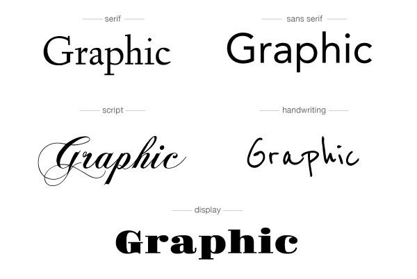
Courtesy of turnarounddesign
Beyond fonts, the other elements of typography which you need to consider are factors like the combination of fonts, spacing between each font, use of white space, sizes, font weight (heavy or light), letter scaling (horizontal or vertical), and capitalisation.
Photo and Images
Finally, your visual brand identity is heavily dependent on the use of images like photos, illustrations, cartoons and other visual design elements.
Here, there are several considerations in creating and selecting the right image for your brand:
- Personality – What are the human characteristics associated with your brand – sincerity, excitement, ruggedness, stylishness, competence? Use these qualities to select the right image.
- Storytelling – Consider the elements of storytelling which are present in the image. Do these resonate with your brand? For example, a dramatic photo of a soccer team hugging each other after a goal was scored could be used for a sports brand that values teamwork.
- Quality – Is the image refined and polished, or does it have a raw and amateur feel? Which would connect better with your brand identity?
- Composition – Naturally, photographs and videos need to be well composed in order to qualify as a “branded”. Rules like the two-third rule, subject of photo (especially humans), and other elements.
- Lighting and Contrast – The mood of an image can be elevated or depressed heavily depending on the use of lighting and contrast.
- Colours – As highlighted above, colours have a strong role to play in conveying one’s brand identity, and the same applies in the use of any image associated with your brand.